In the modern, data-driven business environment, static, rigid reports no longer meet the needs of decision-makers. Businesses in Nigeria and globally require interactive reporting tools that empower users to explore data dynamically. Fortunately, you don't need expensive, complex Business Intelligence (BI) software to achieve this.
Microsoft Excel, utilizing its powerful Slicers and Timelines, offers a simple yet robust way to transform standard spreadsheets into engaging, professional, interactive dashboards. This guide breaks down the essential tools and provides a step-by-step process for upgrading your reporting skills and saving countless hours of manual filtering.
Recommended Articles:
Why Excel is the Ideal Starter Tool for Dynamic Reporting
While advanced tools like Power BI exist, Excel remains the foundational choice for dynamic reporting, especially for SMEs and professionals in Nigeria:
- Universal Accessibility: Excel is globally ubiquitous and already installed in virtually every office environment, eliminating licensing hurdles.
- Low Learning Curve: Most professionals possess a foundational understanding of Excel, making the jump to interactive reporting far easier than learning a new BI platform.
- Cost-Effectiveness: Utilizing existing software reduces upfront costs significantly.
- Versatility: It is perfect for managing and visualizing mid-sized datasets and creating polished presentations.
Key Excel Features for Interactive Reporting
Effective dynamic reporting in Excel relies on combining these features:
- PivotTables: The Analytical Backbone: PivotTables are the core engine. They allow you to instantly aggregate and summarize large raw datasets into meaningful groups (e.g., total sales by region). Every dynamic chart and filter relies on data structured within a PivotTable.
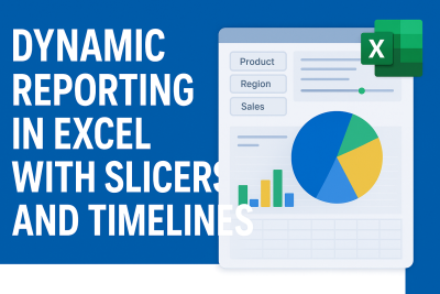
- Slicers: Clickable Segment Filters: Slicers provide clean, professional, and easily clickable buttons that act as filters. Users can segment data across multiple categories (e.g., filter results by a specific Salesperson, Product Category, or Region) with a single click.
- Timelines: Visual Date Filters: Timelines are specialized Slicers designed exclusively for date fields. They allow users to visually drag a slider to filter data by year, quarter, month, or day, making trend analysis intuitive and fast.
- Pivot Charts: These charts are linked directly to PivotTables, meaning they automatically update every time a Slicer or Timeline changes the underlying data. This is what creates the dynamic dashboard experience.
Step-by-Step: Building Your First Interactive Report
Follow this process to transform your static data into a fully interactive dashboard:
Step 1: Prepare and Structure Your Data
Ensure your raw data is clean and structured correctly in a single table (no empty rows or merged cells), with clear headers for every column. Convert your data range into an Excel Table (Insert > Table) for stability.
Step 2: Insert and Configure PivotTables
Create your analytical basis:
- Select your data range, go to Insert > PivotTable.
- Build at least two distinct PivotTables on a new worksheet, summarizing different metrics (e.g., one showing Revenue by Product and another showing Customer Count by Region).
Step 3: Insert Pivot Charts
Convert your summaries into visuals:
- Select one of your PivotTables, go to Insert > PivotChart, and choose an appropriate chart type (e.g., a Bar Chart for comparisons).
- Repeat this for your second PivotTable, perhaps using a Line Chart to show date trends.
Step 4: Insert Slicers and Timelines
Introduce the controls for interactivity:
- Select one of your PivotTables. Go to Insert > Slicer. Choose relevant text fields (e.g., Sales Channel).
- Select the same PivotTable. Go to Insert > Timeline. Choose your primary date field (e.g., Order Date).
Step 5: Connect Slicers and Timelines to All Tables
This is the critical step for dynamic consistency:
- Right-click on any Slicer or Timeline and select "Report Connections..."
- In the dialog box, ensure you check the boxes next to all the PivotTables you created. This links all your charts and tables together, ensuring one click filters the entire dashboard simultaneously.
Step 6: Polish and Present
Move all Pivot Charts, Slicers, and Timelines to a dedicated, clean worksheet named "Dashboard." Hide gridlines, add titles, and use consistent conditional formatting to make the report professional and highly engaging for your audience.
Benefits of Dynamic Reporting
The shift from static to dynamic reporting provides immediate returns:
- Faster Decision-Making: Users instantly find the data they need, eliminating delays.
- User Empowerment: Non-technical staff can perform deep, custom analyses without relying on the data team.
- Professional Presentation: Dynamic dashboards elevate the perceived value and professionalism of your business reports.
- Trend Exploration: Timelines make it effortless to identify and analyze seasonal or long-term performance trends.
Conclusion & Call to Action
Interactive reporting is no longer a luxury; it’s a necessity for staying competitive. With Excel’s integrated Slicers and Timelines, you have the ability to transform static spreadsheets into engaging, powerful dashboards that tell compelling, customized data stories.
Ready to upgrade your reporting skills?
At ECR Academy, Umuahia, Abia State, we offer hands-on Excel training designed for Nigerian businesses and professionals. You will learn not just the mechanics, but the strategy behind building dynamic dashboards that employers and clients respect.
Don’t wait—enroll today and start building Excel reports that speak for themselves!
Frequently Asked Question
What are slicers in Excel?
Slicers are visual filters that make it easy to filter PivotTables and Pivot Charts.
Can I use slicers in Excel 2010?
Yes, slicers were introduced in Excel 2010, but timelines came in Excel 2013.
Do I need coding to create dynamic reports in Excel?
No, Excel’s built-in tools allow you to create dashboards without coding.
Who should learn dynamic reporting?
Business analysts, managers, accountants, marketers, and students in Nigeria can all benefit.
Where can I learn hands-on Excel dashboard building in Nigeria?
You can learn at ECR Academy, Umuahia, which offers practical Excel training tailored to Nigerian datasets.

 Data Analysis
 0 comment
 03 Oct, 2025
SOPHIA OLISE
Data Analyst
Olise Sophia Amarachi is a passionate and purpose-driven data analyst and digital skills advocate based in Nigeria. With a strong foundation in Excel, Power BI, and SQL, she empowers others—especially young people and corps members—through practical training, tech mentorship, and values-based leadership. Sophia’s journey into data analysis began during her NYSC year in Abia State, where she committed herself to learning and growing from scratch. Today, she shares her knowledge through online classes, challenges, and hands-on projects, including dashboards and reports that translate complex data into clear insights.
0 comment